Expat Money
UI/UX design
Task
App flow for Sign Up & KYC for ExpatMoney App & Account which is easy to understand and complete in terms of information to be collected for Regulatory requirements.
Context
ExpatMoney is an app that helps people on 5 aspects – Savings, Remittance, Payments, Credit, and Investments. It is a one-stop app for mentioned needs with an Account at the core.
Scenario
Presently, a vast user group in Dubai and other parts of UAE comes under the salary cornet of 10K AED p.m. However, this group is exceptionally high in number but is not the primary focus for Dubai's financial institutions.
The majority consists of essential workers who find it challenging to manage their accounts as they face difficulties like sending money to their homes, investing, seeking credit, etc.
Essential worker in Dubai
Hypothesis
All in one fintech app might solve users' current pain points.
User-centric design and easy-to-understand navigation is the right approach.
Easy sign-up and friendly design ( non-jargon ) will attract customers.
It should not show similarities to banking apps as they can be overwhelming for our target group.
Expected outcome
Design Sign Up journey for ExpatMoney App. As ExpatMoney has Payments, Credit & Investment Flows powered by 3rd Party Providers who may have their own KYCs & User may have already gone through the process, KYC for ExpatMoney is not Mandatory. However, if User wants to Open an Account with ExpatMoney (powered by ABC Bank), User has to undergo KYC for the Account.
App flow for Sign Up & KYC for ExpatMoney App & Account which is easy to understand and complete in terms of information to be collected for Regulatory requirements.
Business Goal
Be a potential leader that takes care of end to end financial and banking needs of the expats that come under the funnel of under 10K p.m.
Target Group
Process
As the current brief is to design for an upcoming app. I have focused more on desk research, specifically cross-app analysis. However, the focus is on usability, desirability, and easy navigation.
Process followed
Cross app analysis
Conceptualization and wireframing
UI design
UI testing on mobile
Areas of opportunities ( for potential features )
Assumptions
The user has an Apple, Gmail ID
Can navigate around customer-facing apps and social media.
Understands basic banking terms
Keeps EID card
Takeaways from cross-app analysis
Most apps have a sign-up flow that increases the cognitive load on the user by requesting them to fill in a lot of details at one point.
Although some products have tried to make the onboarding quite smooth eg: Liv and Xare
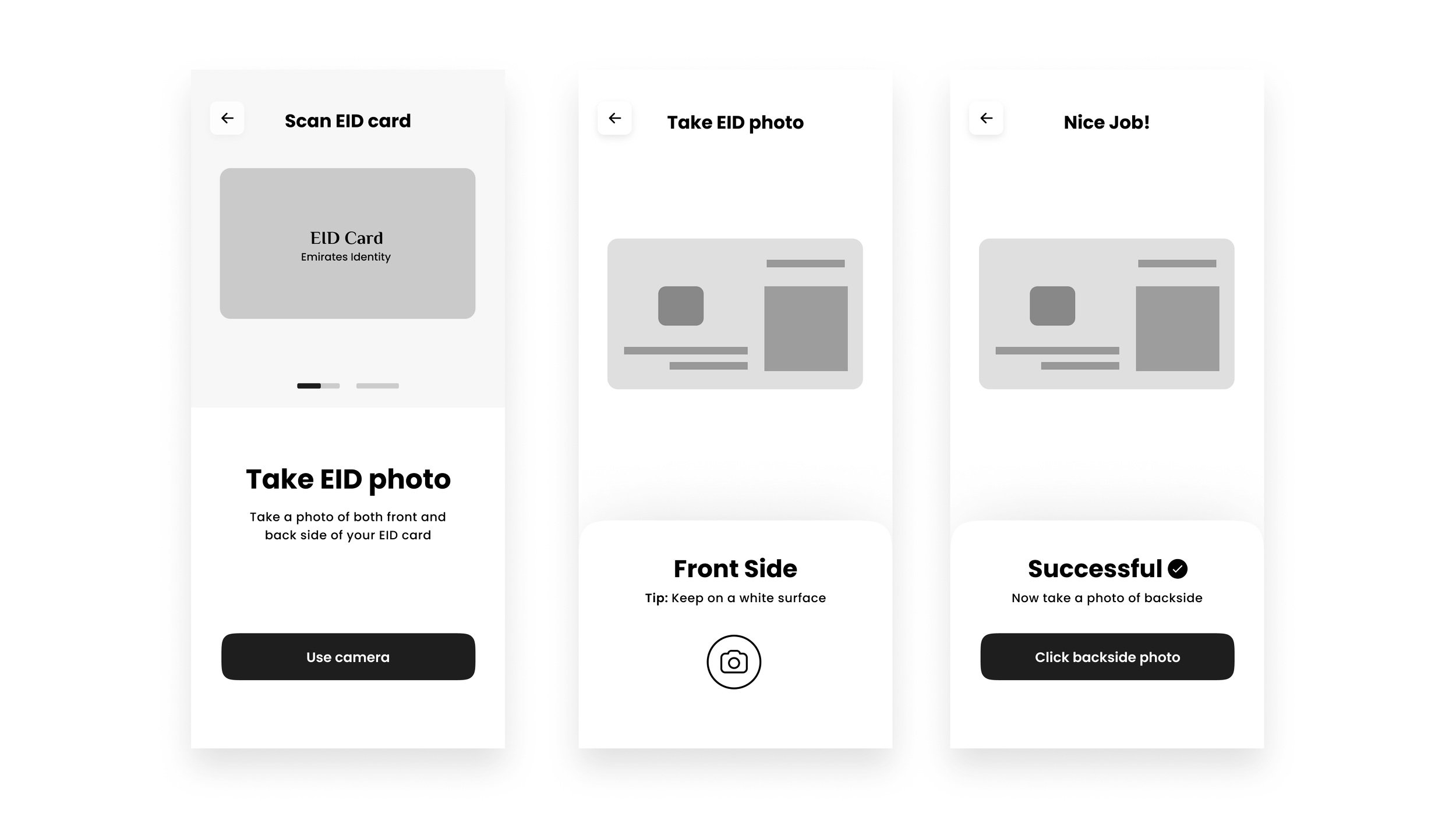
By scanning EID and confirming email and mobile, a lot of steps can be reduced to make onboarding smoother.
Design Directions
Design sign-up flow user friendly and jargon-free.
Divide the current long KYC process into smaller experiences and delight users in those gaps.
The semantics of the app should be like a lifestyle product. Something that our users relate to and understand. E.g.: Facebook, Talabat, etc.


Sign up flow
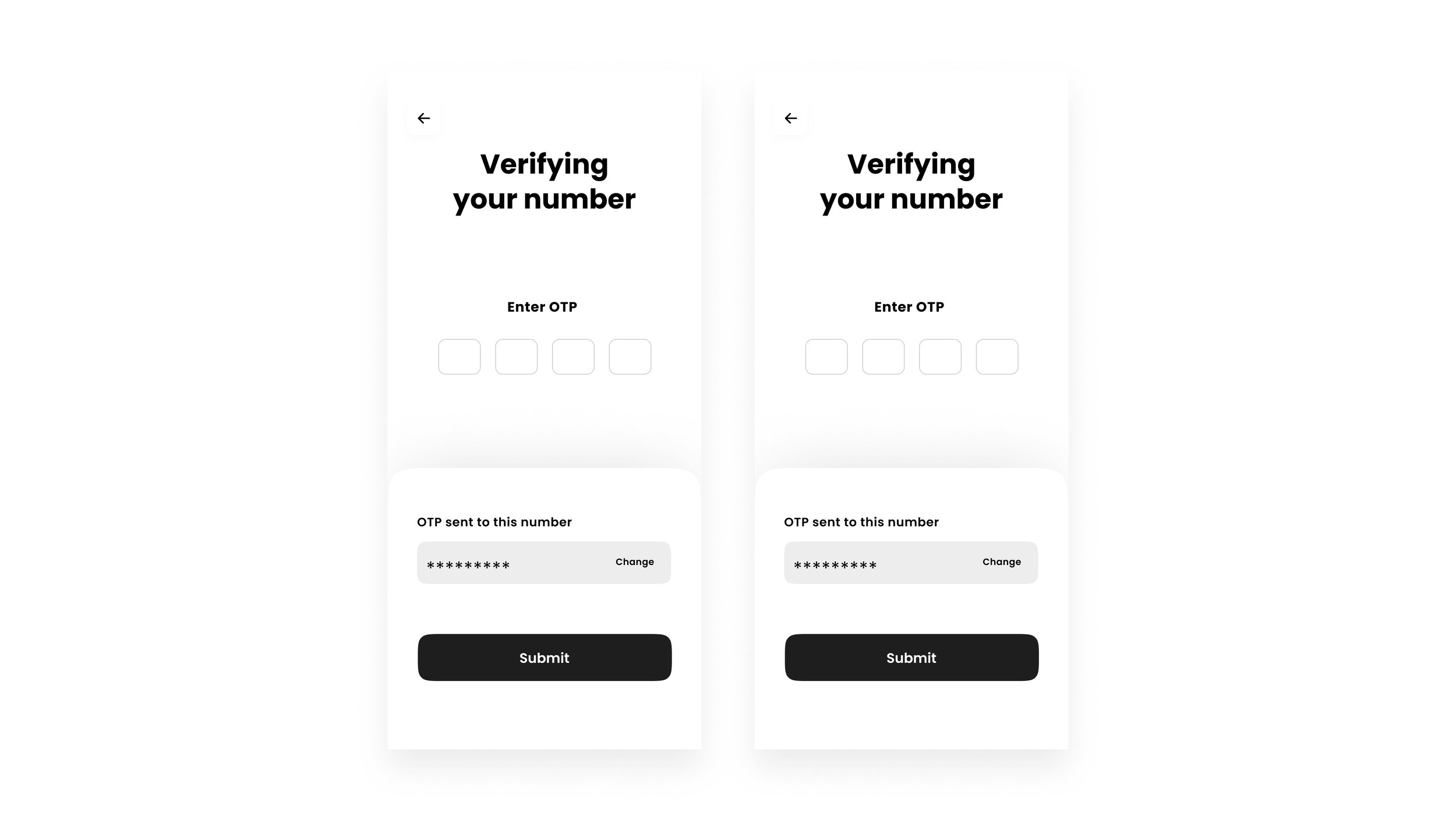
Instead of asking for all the details for KYC upfront, the minimum required information is requested from the user. The idea is to let them enter the home screen and experience the product services and advantages first.
Create an account
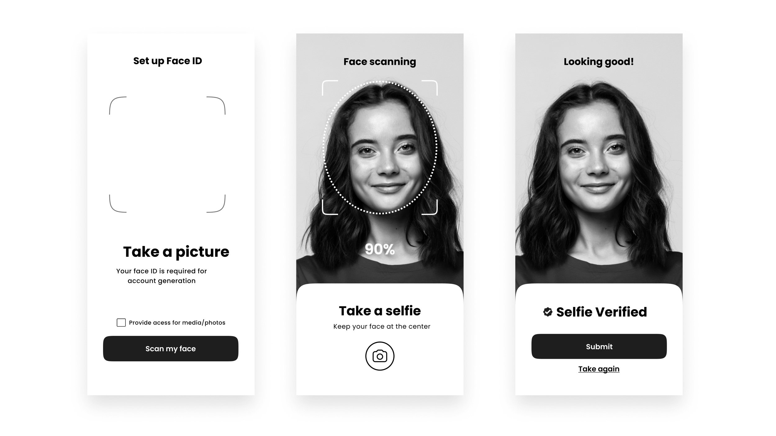
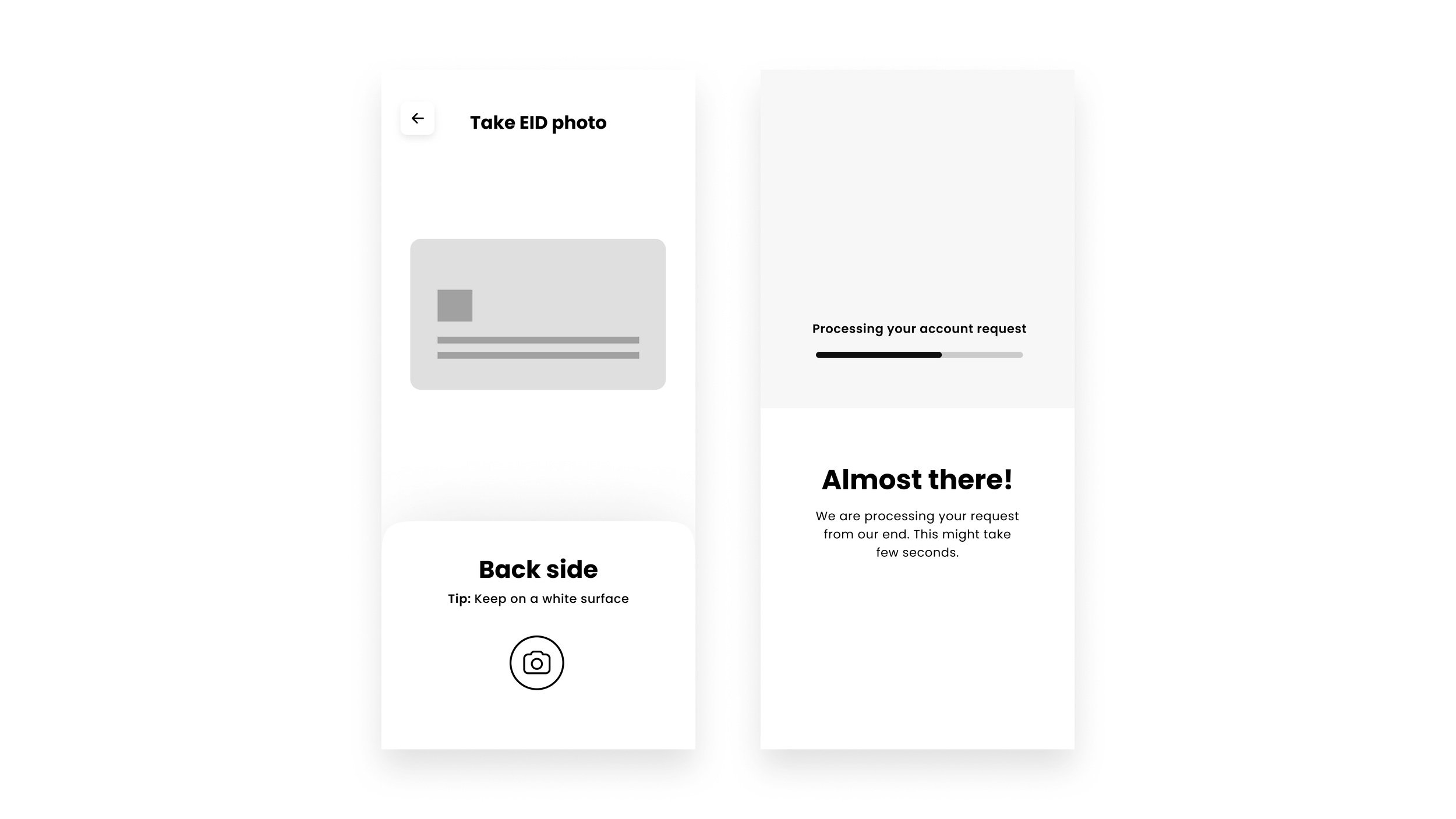
As the user has already shared an Email ID and confirmed mobile number, Scanning the EID card and face can be the two significant tasks user has to do for KYC. Liv app currently uses similar philosophy however focus here is to reduce any frictions even further to provide a seamless experience.
The design has multiple gateways to open an account, including a promotional card on the top of the home screen. The account creation journey is pretty concise. Elements like customizing a debit card with the preview attempt to create user anticipation and delight.


